is also a type foundry
based in Aspet (31),
at the foot of the Pyrenees
in the south west of France.
Buro Regular
Buy532 glyphs
5 styles
2018 - 2021
Specimen
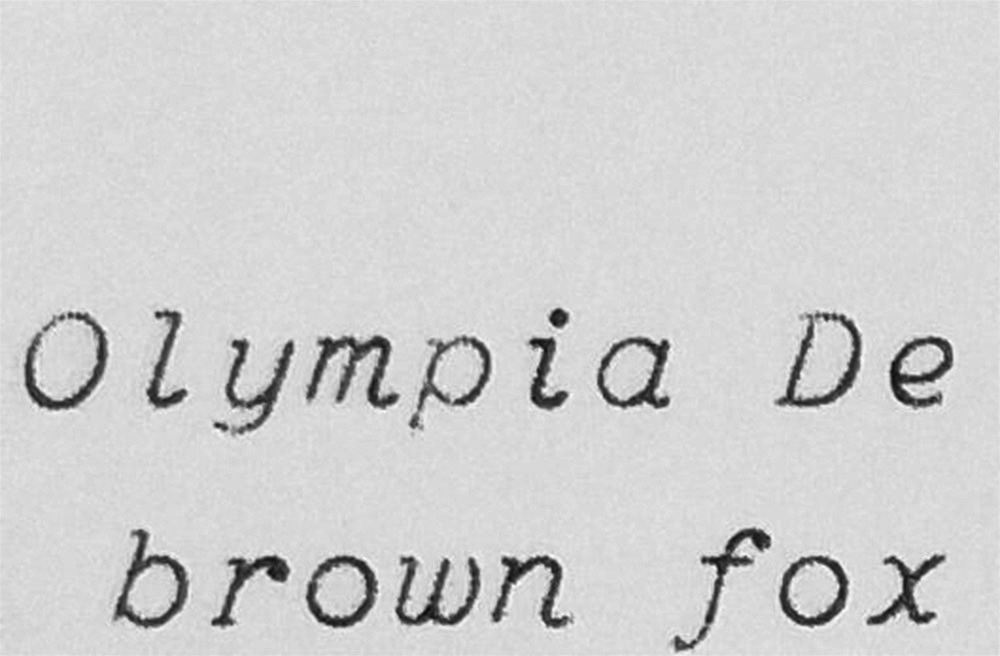
The Buro is a text font, monospaced, sans-serif with rounded endings.
It is characterized by its monolinear outline (low contrast, light optical corrections) and its discontinuous Roman structure. It tries to reproduce the outline of a letter drawn with a pen. Buro’s design is inspired by the cursive letters used in Olympia typewriters of the 1950s.
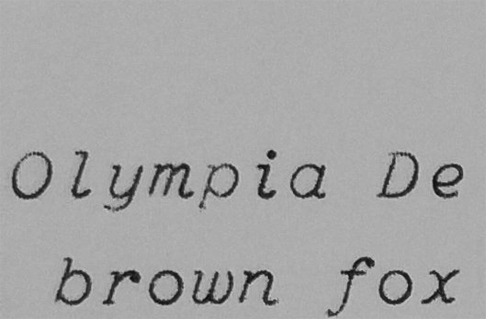
Sample text from an Olympia De Luxe (1950), source : london typewriters
PERFECTION is THE ENEMY
of PERFECTLY ADEQUATE.
SLIPPIN’ JImmY in BEttER CAll SAUL
Mekka Width 1
Buy567 glyphs
3 styles
2014 - 2022
Specimen
The Mekka is a titling, sans-serif typeface marked by a rigid, mechanical structure. Initially inspired by painted lettering, observed in Lyon in the deployment of road signage for the city of Lyon's bus network. The Mekka inevitably recalls the works of avant-garde artists such as those of Aleksandr Rodchenko.
Its design, declined in three width, presents in a stabilized form the formal and structural richness that preexists within the innumerable monumental occurrences of the word “BUS”. Its composition system (ligatures) accentuates the verticality of its design and allows the word to be worked on like an image.
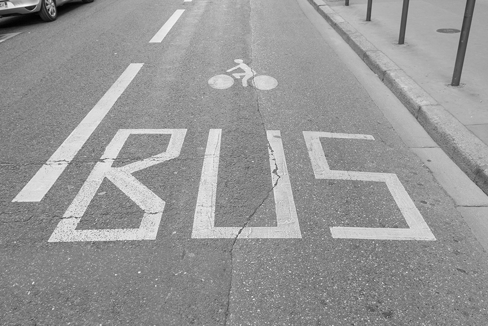
Roll-painted lettering belonging to the signage of the Lyon city bus network, personal photograph, 2015.
BIBLIOTHÈQUE MUNICIPALE DE TOULOUSE — BOURSE DU TRAVAIL
Montariol Bold
Buy466 glyphs
1 style
2019 - 2021
Specimen
The Montariol is a typeface of titling, sans-serif, geometric and quite black, whose style of letters comes from the artistic movement of Art Deco.
Its design, inspired by a sculpted sign in Toulouse (France), is particularly marked by its triangular ‘A’, its staircase ‘E’ and finally its dynamic wave-shaped ‘S’. Its black weight it a certain strength, and gives weight to the titles. The composition of the words is punctuated by the contrasting proportions and the singularity of some of its letters.
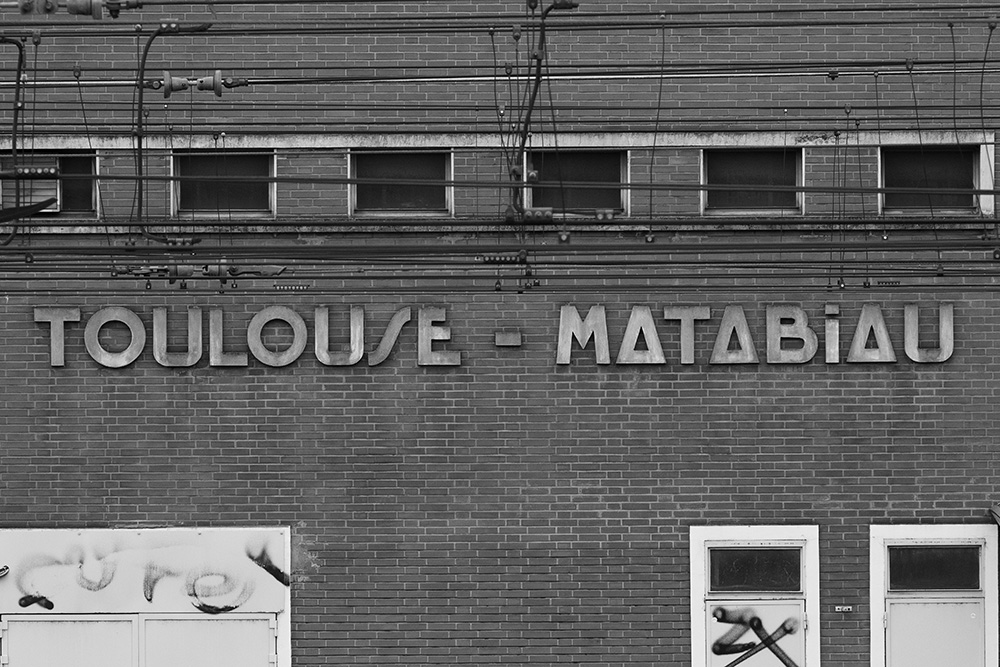
Sign appearing on a building south of Toulouse train station, personal photograph, 2019.
THEO VAN
DOESBURG
- ePPs & evaNs
Alfabet Bold
Buy496 glyphs
1 style
2020 – 2021
Specimen
The Alfabet is a titling, sans-serif typeface, inspired both by the work of engineers Timothy Epps and Christopher Evans (1969), and letterings designed by painter and architect Theo Van Doesburg in the 1920s.
Based on a 25-square grid, its design once again attempts to rationalize to the extreme the canonical structure of the Latin alphabet.
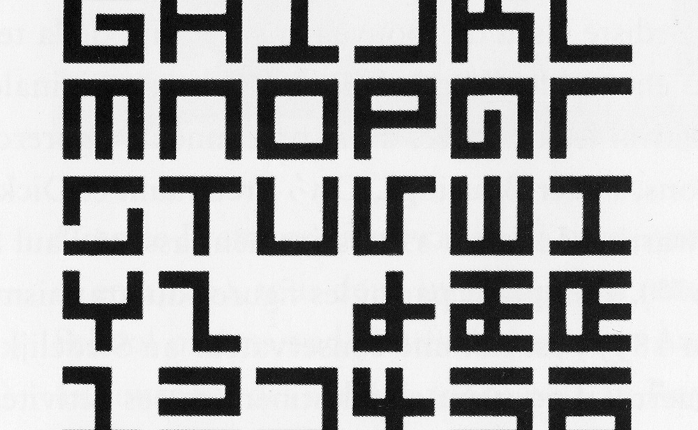
Alphabet intended to be read by a machine, Timothy Epps and Christopher Evans, National Physical Laboratory, Division of Computer Science, Great Britain, 1969.
Olympia De Luxe – New Ribbon, Case – Grey – Cursive Font – Made In Western Germany
Buro Regular Italic
Buy532 glyphs
5 styles
2018 - 2021
Specimen
The Buro is a text font, monospaced, sans-serif with rounded endings.
It is characterized by its monolinear outline (low contrast, light optical corrections) and its discontinuous Roman structure. It tries to reproduce the outline of a letter drawn with a pen. Buro’s design is inspired by the cursive letters used in Olympia typewriters of the 1950s.
Sample text from an Olympia typewriter, De Luxe model (1950), source : london typewriters
THE THOUGHT of MAYBE
BEING A GooD PERSON
is WHAT KeePS ME TRYING
MAYBE THERE’S SOMETHING to THAT.
Rue, EUPHORIA, S2 - E8
Mekka Width 5
Buy567 glyphs
3 styles
2014 - 2022
Specimen
The Mekka is a titling, sans-serif typeface marked by a rigid, mechanical structure. Initially inspired by painted lettering, observed in Lyon in the deployment of road signage for the city of Lyon's bus network. The Mekka inevitably recalls the works of avant-garde artists such as those of Aleksandr Rodchenko.
Its design, declined in three width, presents in a stabilized form the formal and structural richness that preexists within the innumerable monumental occurrences of the word “BUS”. Its composition system (ligatures) accentuates the verticality of its design and allows the word to be worked on like an image.
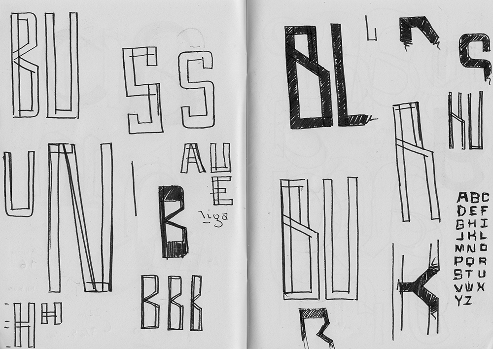
Mekka typeface sketches, personal sketchbook, 2017.
Puylaurens
Cambon
bertre
lavaur
Bevel Medium
Buy475 glyphs
1 style
2017 - 2021
Specimen
The Bevel is a titling, stencil and sans-serif typeface. His design is inspired by a series of old zinc stencils bearing the names of different villages in the Tarn region (France).
Its mechanical structure and its total absence of curves, make its design particularly raw and robust. It is characterized by its surprising tenons, in particular in its ‘M’ and its ‘N’. Its solidity is accentuated by the proportions of its narrow letters, and its low spacing.
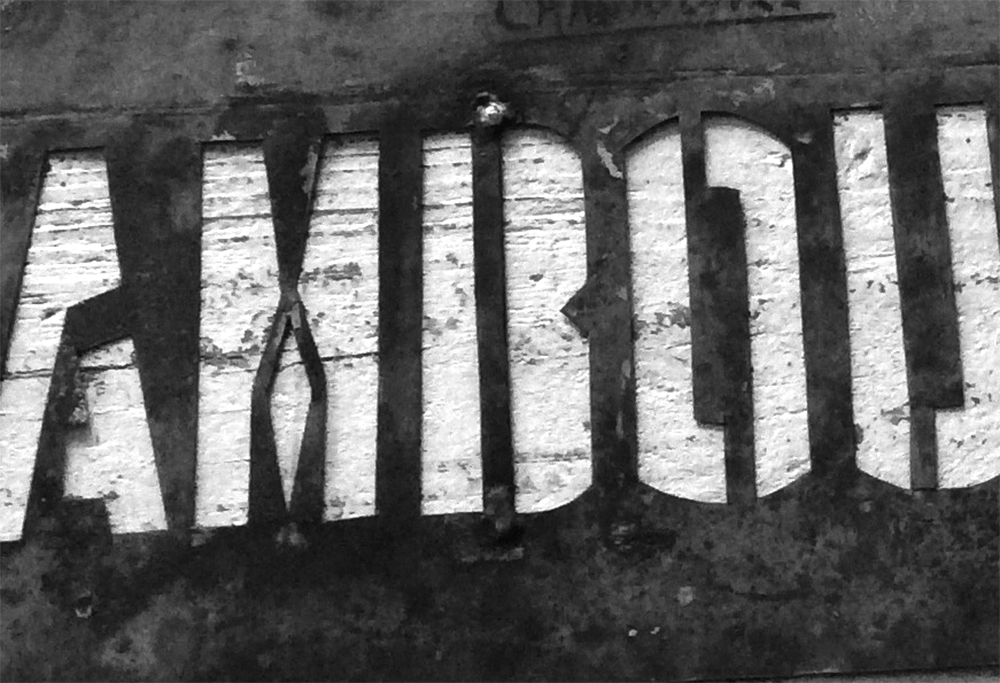
Zinc stencil bearing the names of different villages in the Tarn region (France), variable dimensions, personal photograph, 2020.
NO GOD!
PLEASE NO!
NO!
Buro Bold
Buy532 glyphs
5 styles
2018 - 2021
Specimen
The Buro is a text font, monospaced, sans-serif with rounded endings.
It is characterized by its monolinear outline (low contrast, light optical corrections) and its discontinuous Roman structure. It tries to reproduce the outline of a letter drawn with a pen. Buro’s design is inspired by the cursive letters used in Olympia typewriters of the 1950s.
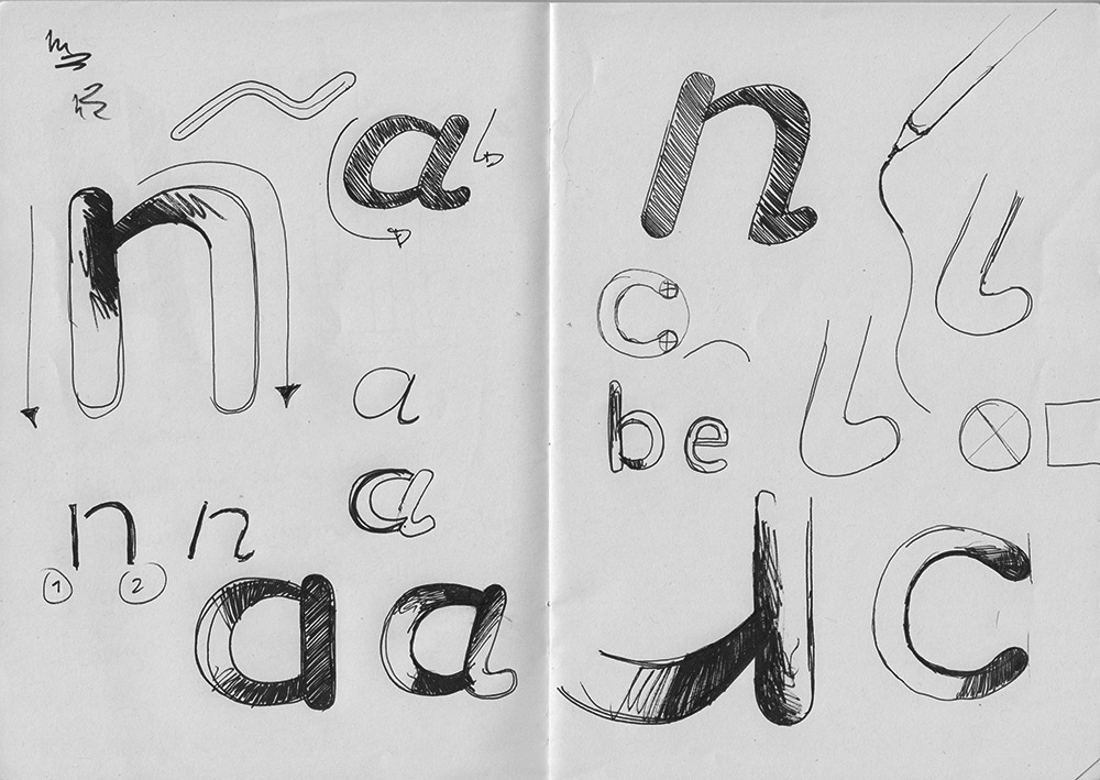
Buro typeface sketches, personal sketchbook, 2019.